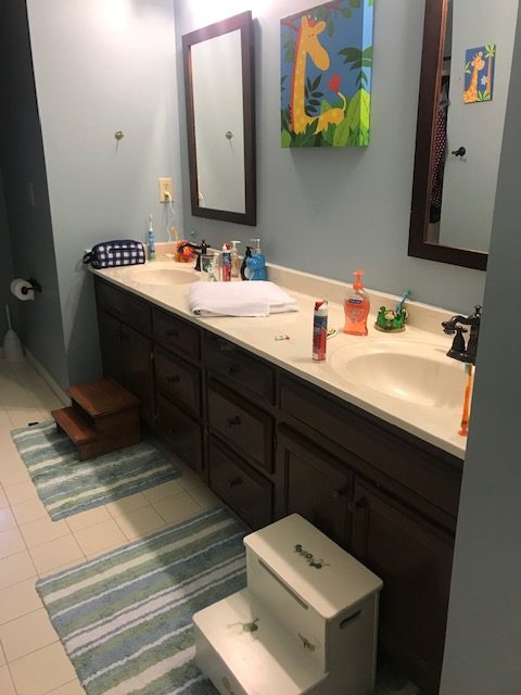
When we moved into our house 5 years ago there were a number of rooms that I didn’t like but we had to prioritize which projects to do first so the guest bathroom / kids bathroom was low on the list. It worked and it wasn’t horrible but the cabinets had been painted very badly by the previous owners and the grout on the cream tile was stained and just never looked clean to me.

So, a few months ago I decided it was time to finally tackle the guest bathroom so I approached this like I do with my clients…found inspiration, selected materials and scheduled the contractor to get to work.
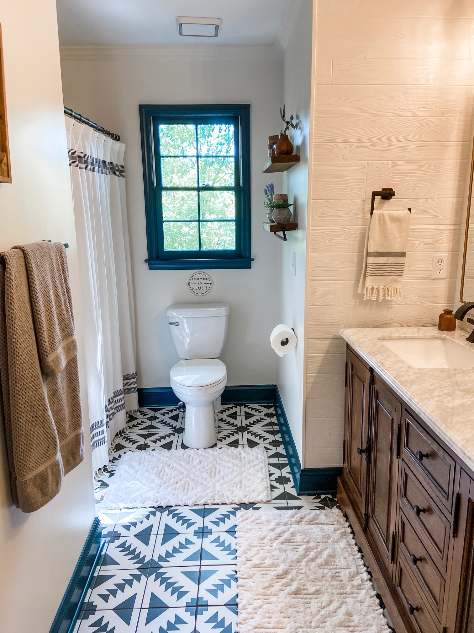
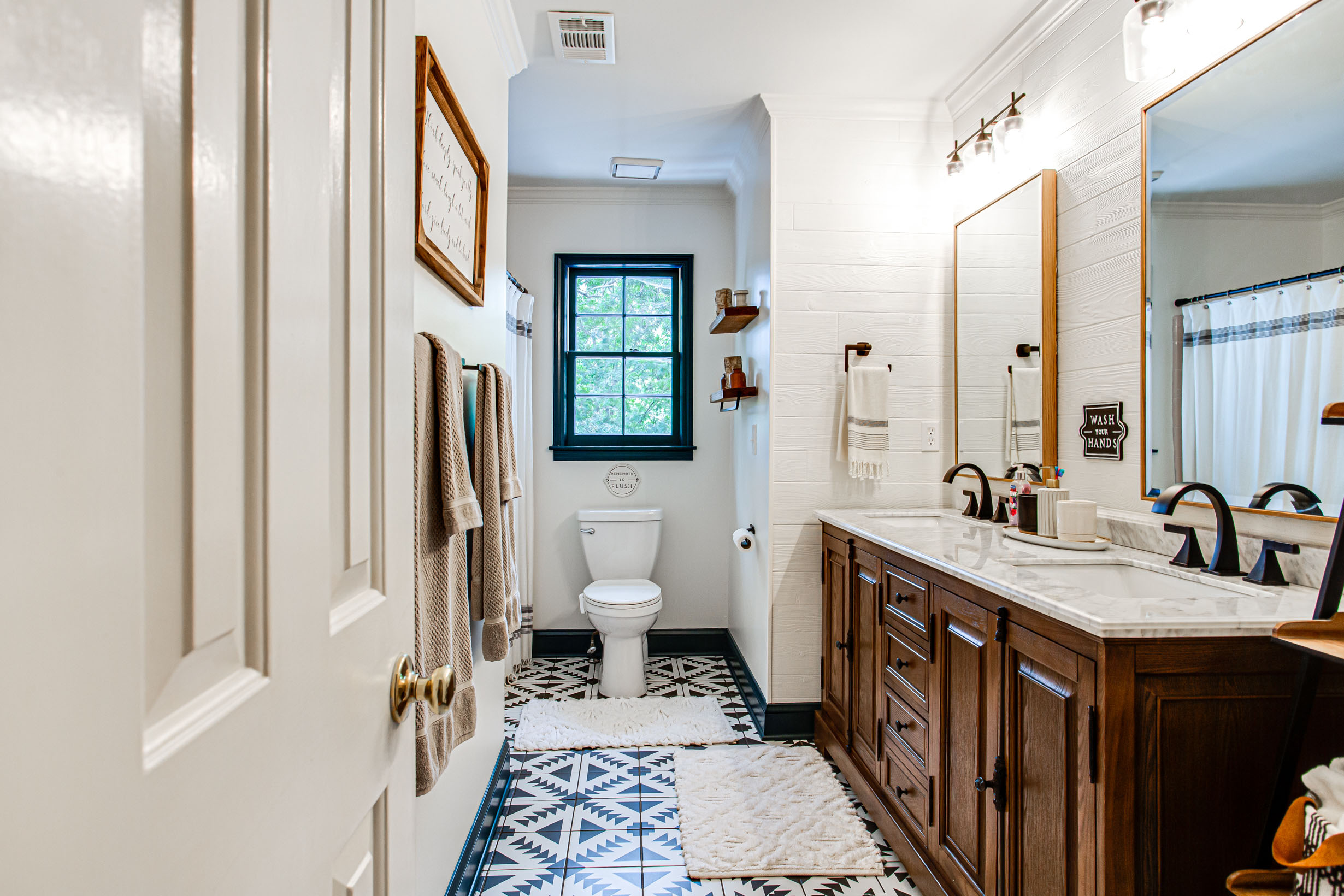
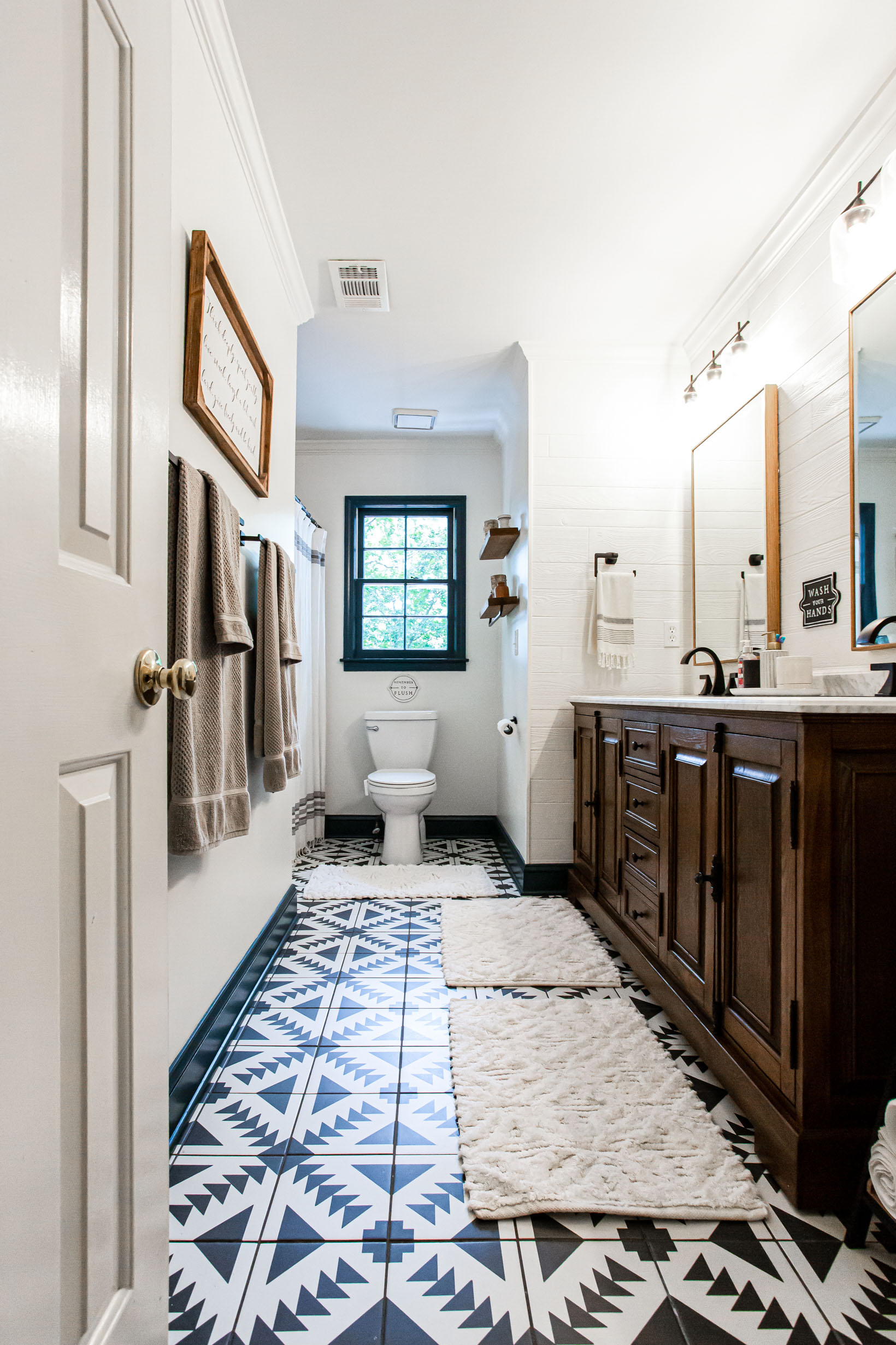
It took about 10 days total but keep in mind, we didn’t touch the tub-shower area. We will eventually update that and probably do a shower only down the road but my kids still use the tub so we kept that as it was and hung a new shower curtain.
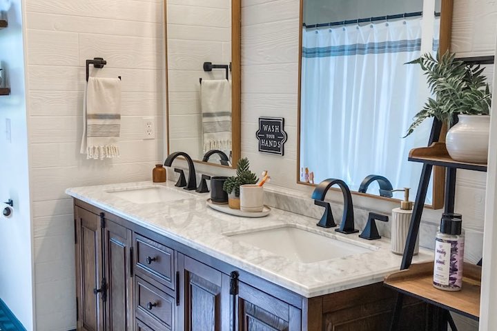
My vision for the space was a bright, modern bathroom with texture that didn’t look too kid-ish. This is the bathroom that guests use and is shared by my 2 boys so I needed it to be elegant enough for a guest but as also practical and sturdy enough for 2 growing boys.
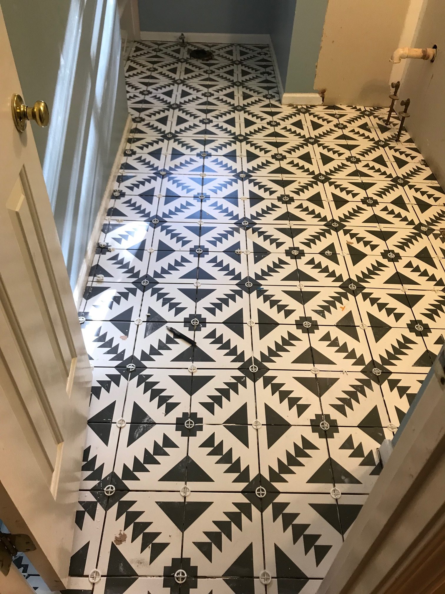
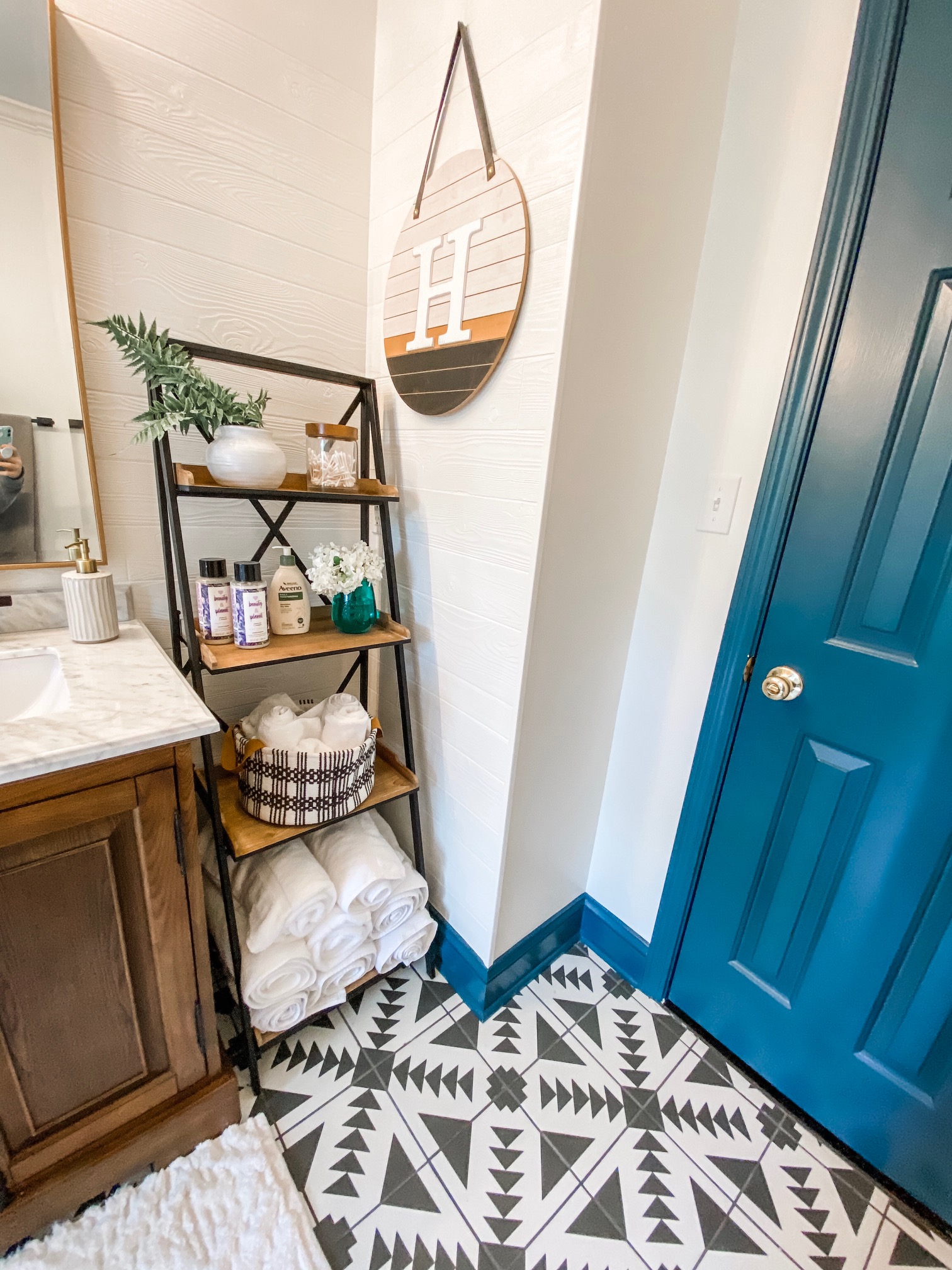
So I selected a bold Apache geometric tile for the floor in a cream and black design. My husband and the tile guy thought I was crazy to do such a busy pattern on the floor but I love this floor so much!! And I knew this would be the 1 busy element in the room which I balanced with the off-white painted walls and the wood vanity. The idea was to add more interest with texture and not pattern.
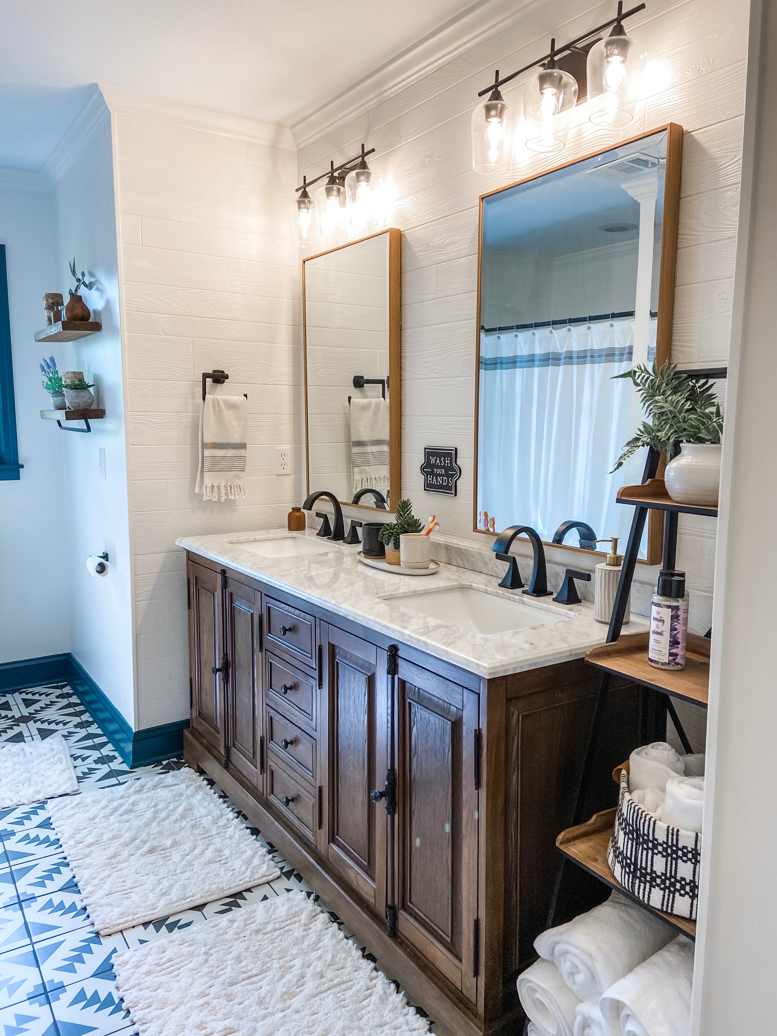
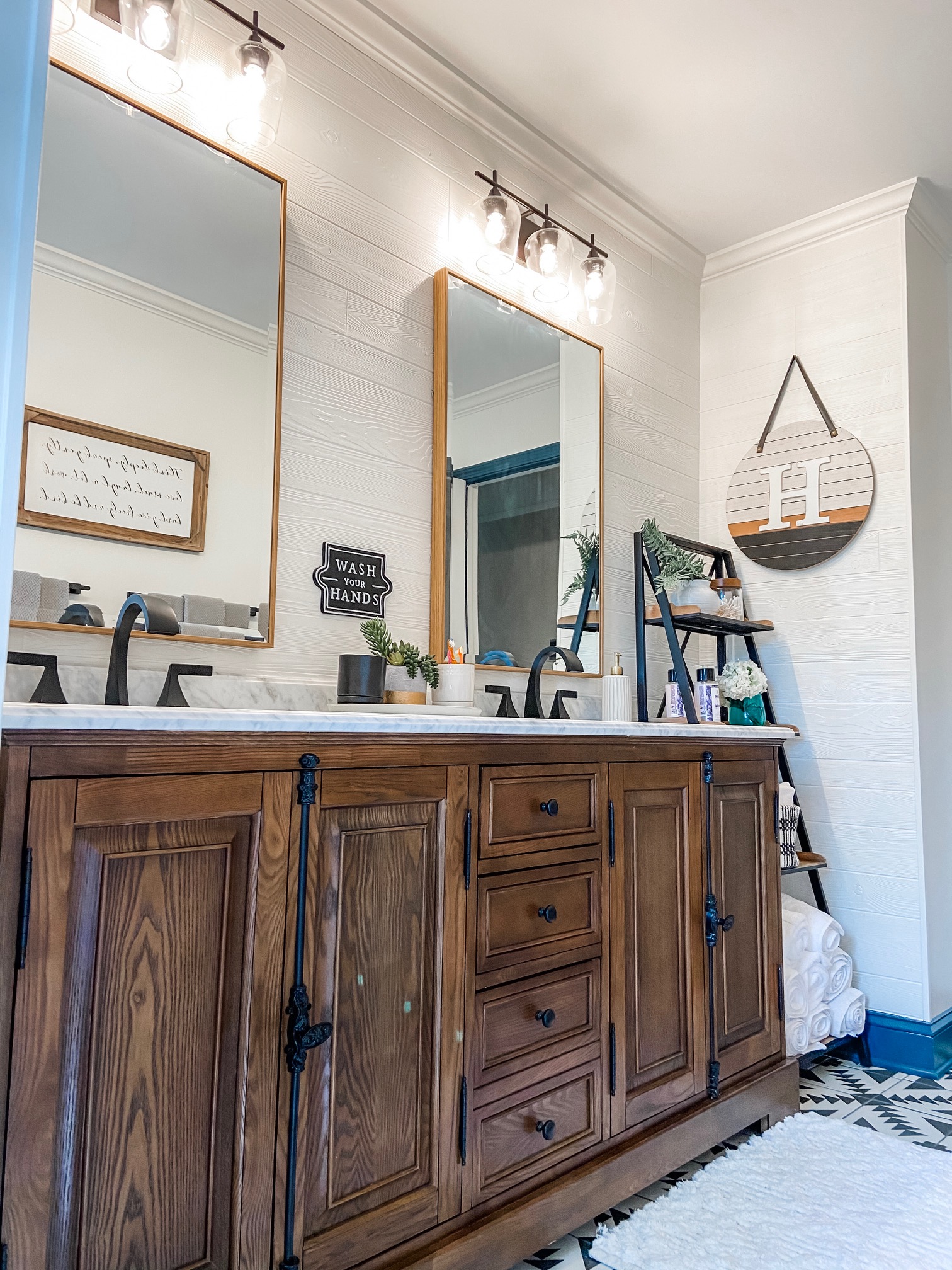
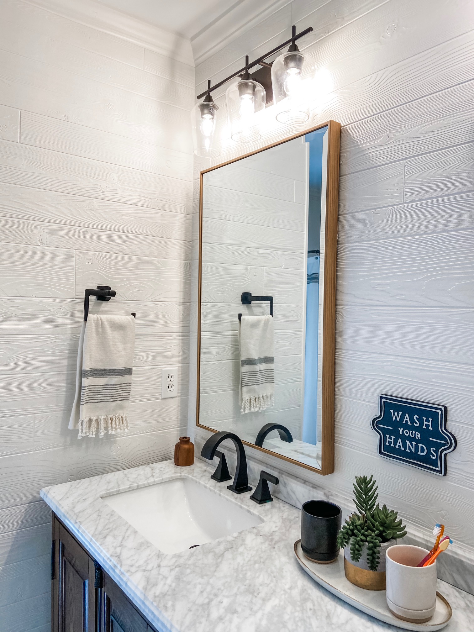
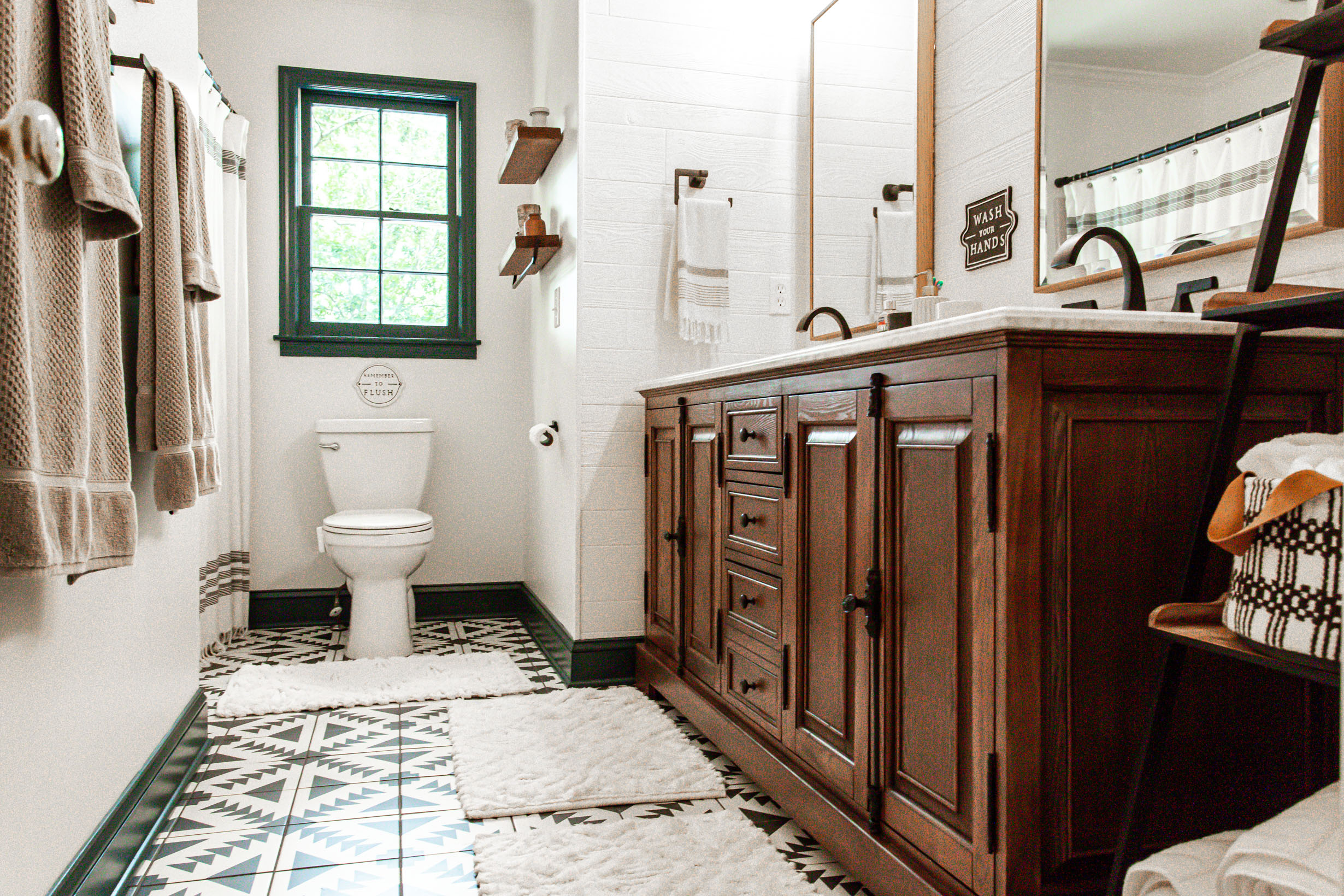
On the wall behind the vanity I wanted to do a shiplap wall…and yes I know shiplap has been everywhere and my house isn’t farmhouse style by any stretch but I haven’t had a chance to do any in my house so I decided to try it as an accent behind the vanity. Instead of smooth shiplap, I wanted something that showed the texture of the wood so I found textured wood shiplap paneling at Lowe’s that we ended up putting on 3 walls and then painting the paneling and the other walls Alabaster by Sherwin Williams.


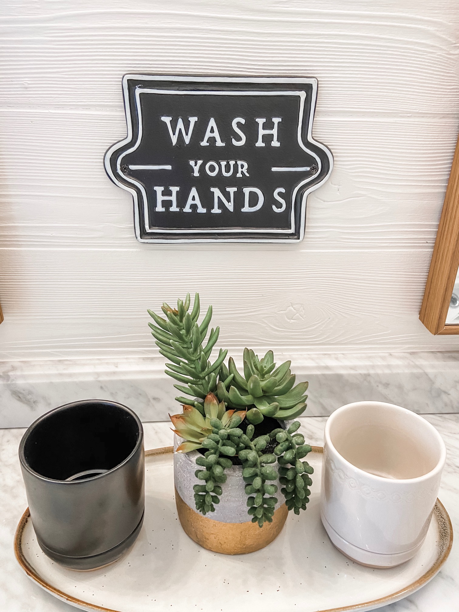
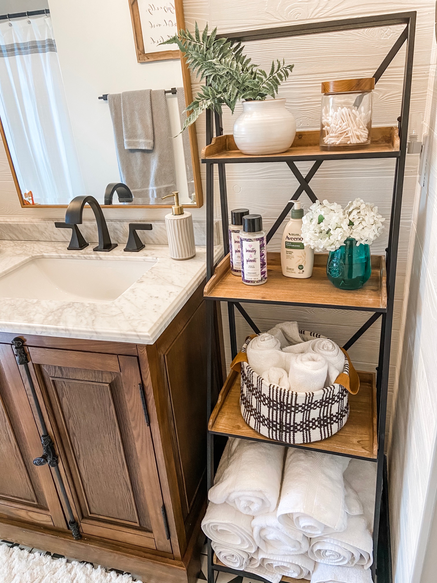
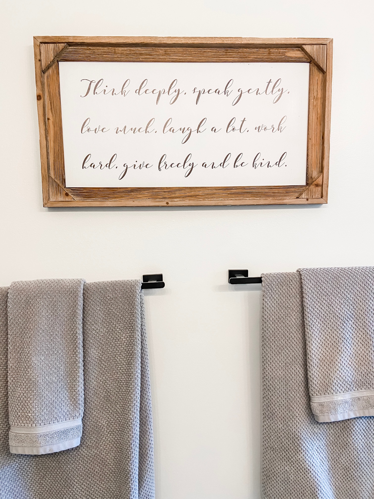
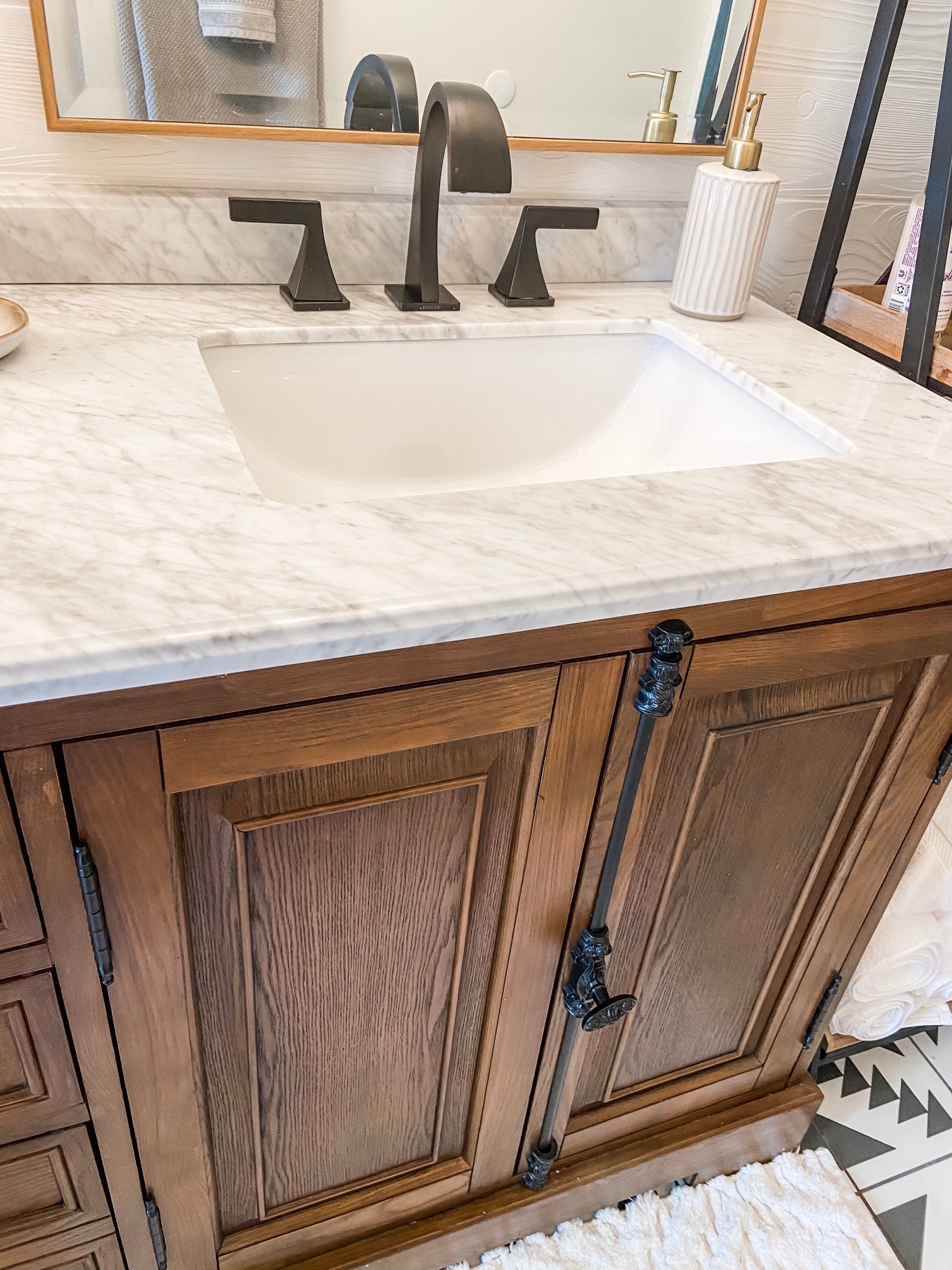
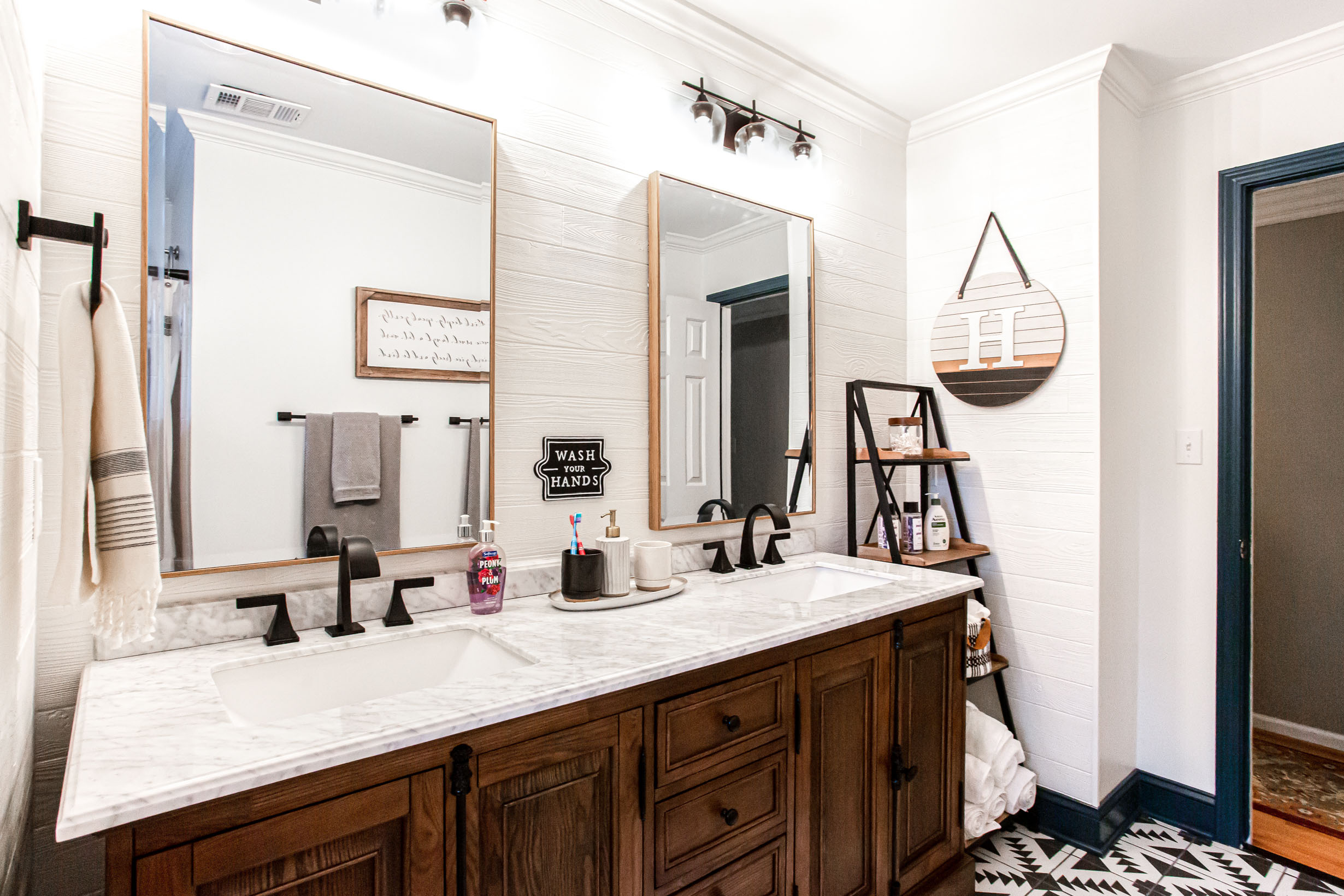
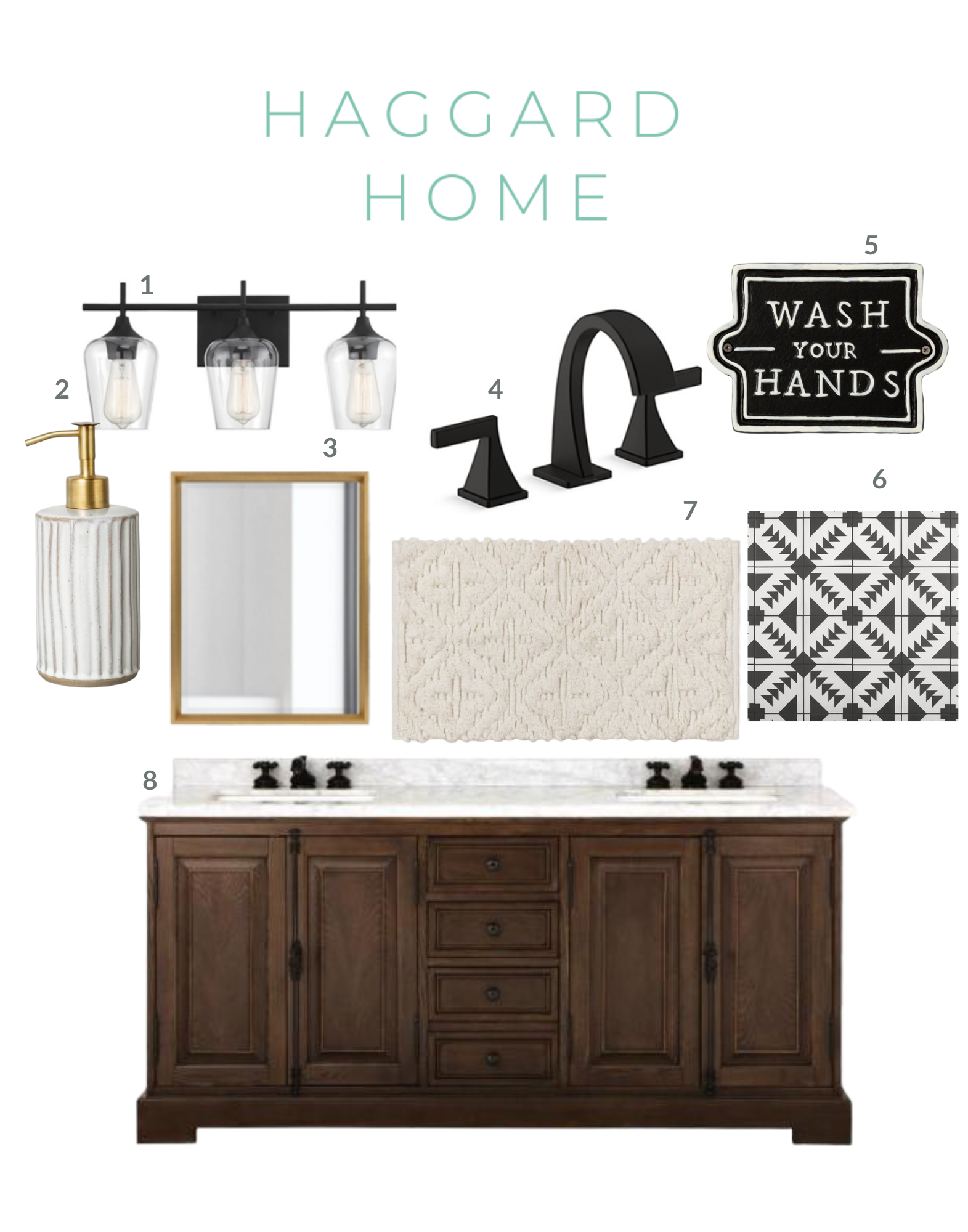
For the vanity, I am a cabinet dealer but I wanted a furniture style vanity on feet and ended up finding a 72” double sink vanity with a Carrara marble top from Home Depot at a great price so I ordered it. The vanity had lots of storage with drawers in the center and storage beneath the sinks as well. The old vanity went wall to wall but I wanted a space for a shelf where I could store towels and things for my guests so I chose a shorter vanity so I had room for my shelves. I found a cute shelf unit from Wayfair that fit the space perfectly! I rolled towels on the bottom shelf for my guests and put smaller washcloths and hand towels on this cute black & cream basket from Target.
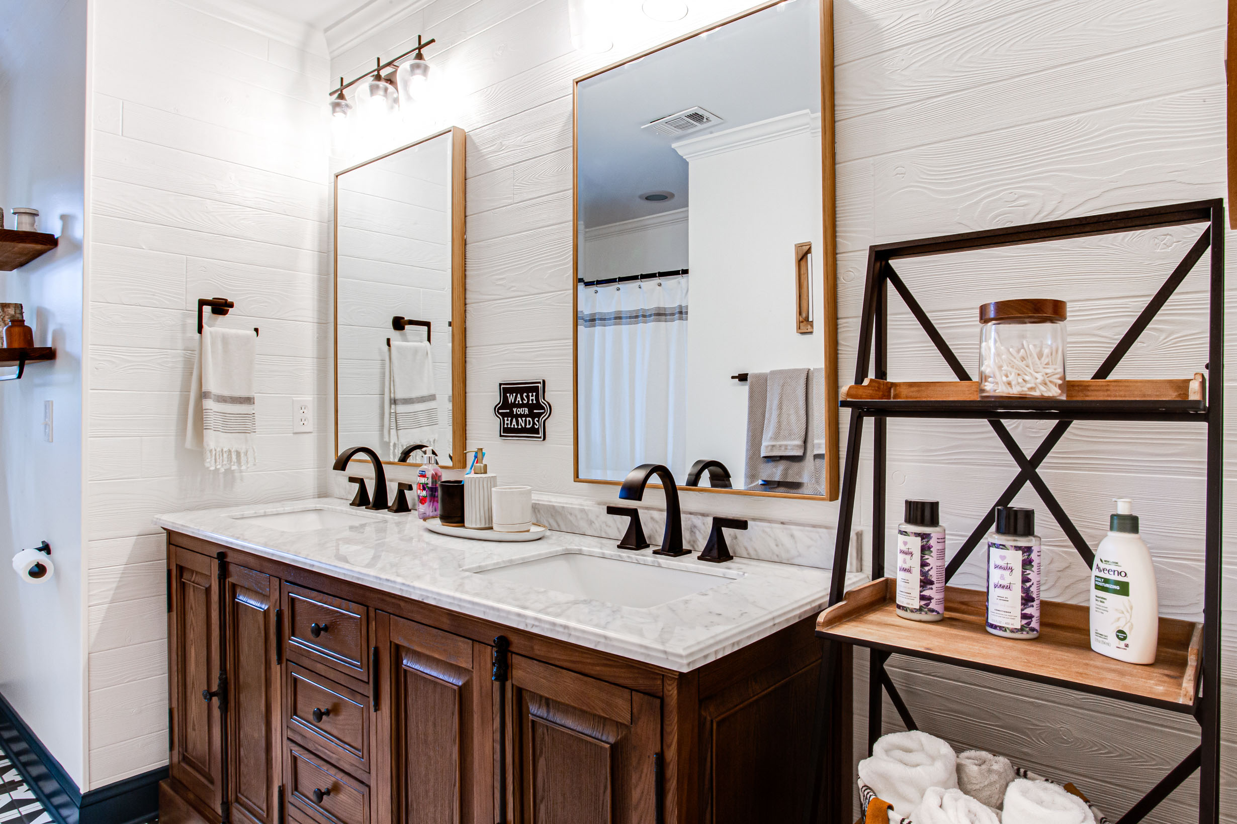

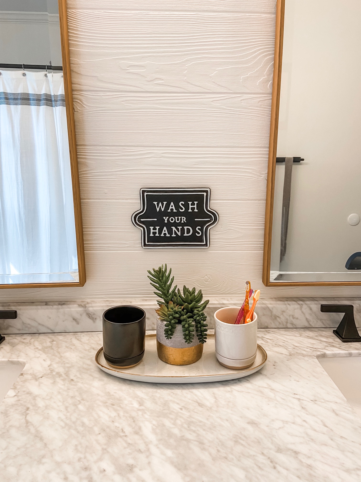
For the vanity lights, faucets and bath accessories I chose a matte black to coordinate with the black & cream pattern on the tile. I think matte black fixtures look a little more masculine than a polished finish which is what I wanted for this room. I chose large rectangular mirrors with a brushed gold frame to go above each sink and these were a score at only $90 each from Target.
A bathroom is more than just tile and a new vanity…it’s the little details that make the room truly special so I changed out the baseboards for taller ones and chose a dark teal paint for the trim in the room…and yes my husband thought I was bonkers but even he agreed it looked good after it was complete. We painted the back of the bathroom door, the door trim, window trim and baseboards but we painted the crown at the top of the room the same color as the walls. I didn’t want a dark teal stripe at the ceiling because I wanted the ceiling to appear higher than the 8’ ceiling it truly is. And by painting the crown a dark color it would’ve made the walls look shorter in my opinion. As a designer I have people ask all of the time how trim is usually done but there is no such thing anymore. In a world where we have dark trim and lighter walls, dramatic accent color trim or white trim throughout…there is no right way to handle paint on walls, trim or ceiling. Every room is different and it depends on what you want to accent in each space!
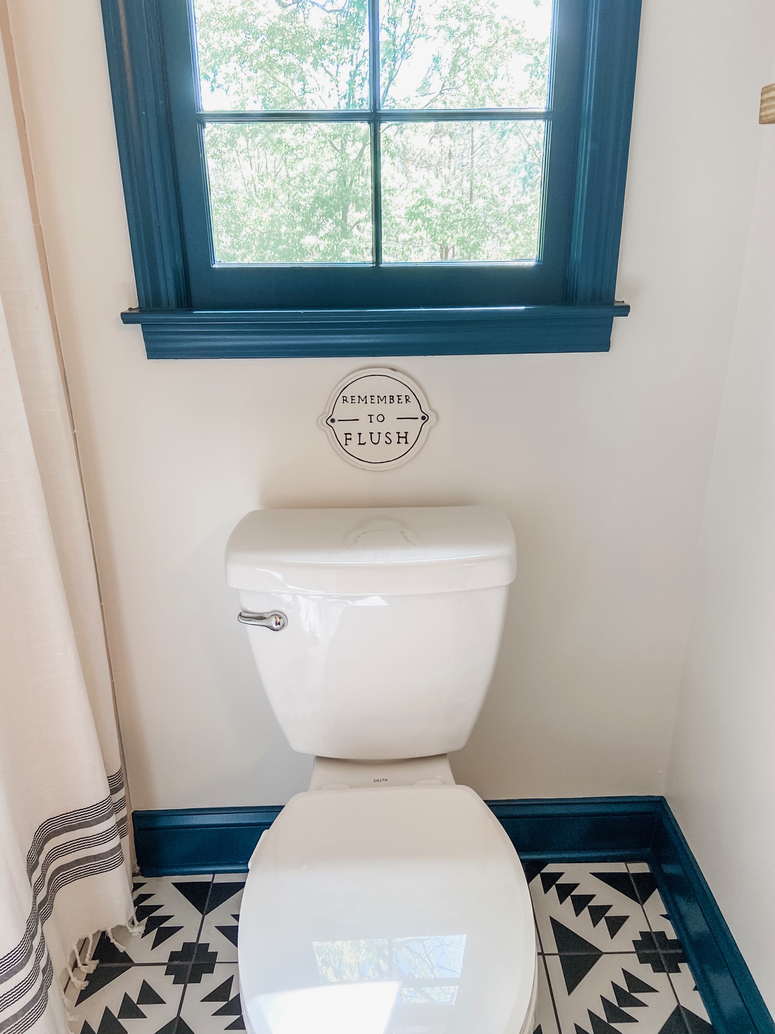

Other details I added were the shallow floating shelves near the toilet since that wall looked empty without something there. I also added 3 patterned cream bath mats on the floor. I didn’t add heated floors to this room so I put a mat in front of each sink and the shower to warm up your feet and to break up all of the patterned tile just a bit.
Here are some words of advice from my bathroom renovation. Don’t be afraid to take a risk…if you find a busy tile or other element that really speaks to you, then go with it! Your bathroom shouldn’t look like every other bathroom you see online….be unique and true to yourself. But remember you need 1 or 2 focal points in a space…if you have a bold tile on the floor, balance it with a solid color on the walls. And don’t forget texture matters whether it is on the cabinets, bath mats or a textured wall like I did.

I’m thrilled with how our boys bathroom turned out! It didn’t break the bank thanks to some aggressive online shopping by yours truly and I love the warm, rustic modern vibe! Thanks for letting me share it with you!

Shop the look below!
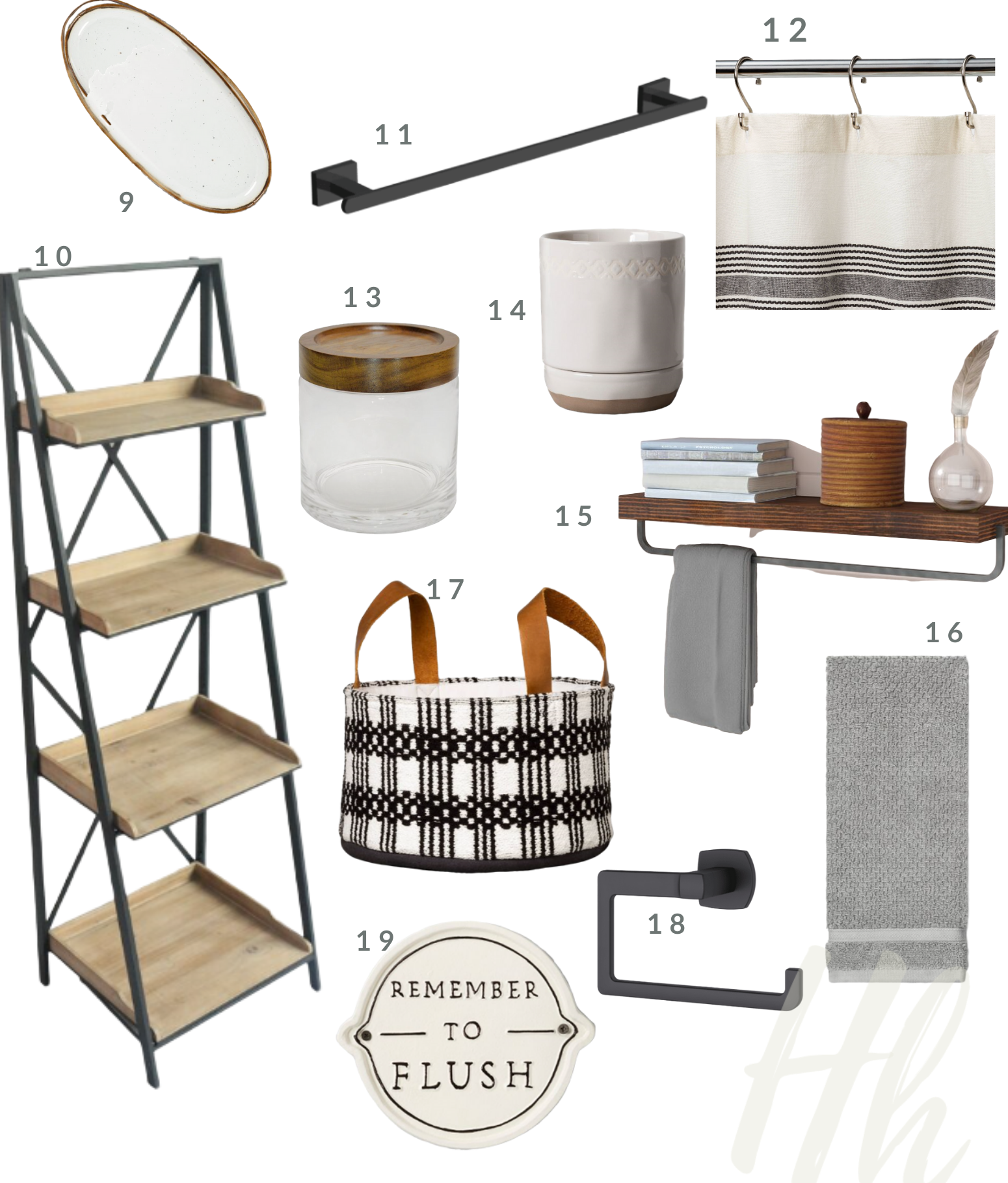
1 // 2 // 3 // 4 // 5 // 6 // 7 // 8 // 9 // 10 // 11 // 12 // 13 // 14 // 15 // 16 // 17 // 18 // 19