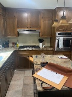
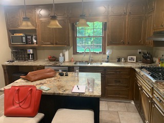
Our clients purchased this house because they loved the layout and location. Though the house was dated, they were able to make small changes themselves to update the house. But when it came to the kitchen, they had no idea where to start.
The kitchen was small and cramped. It had mostly original cabinets and a few added by the previous owners but the layout was flat and as a couple who likes to entertain they did not like how closed off the kitchen was.
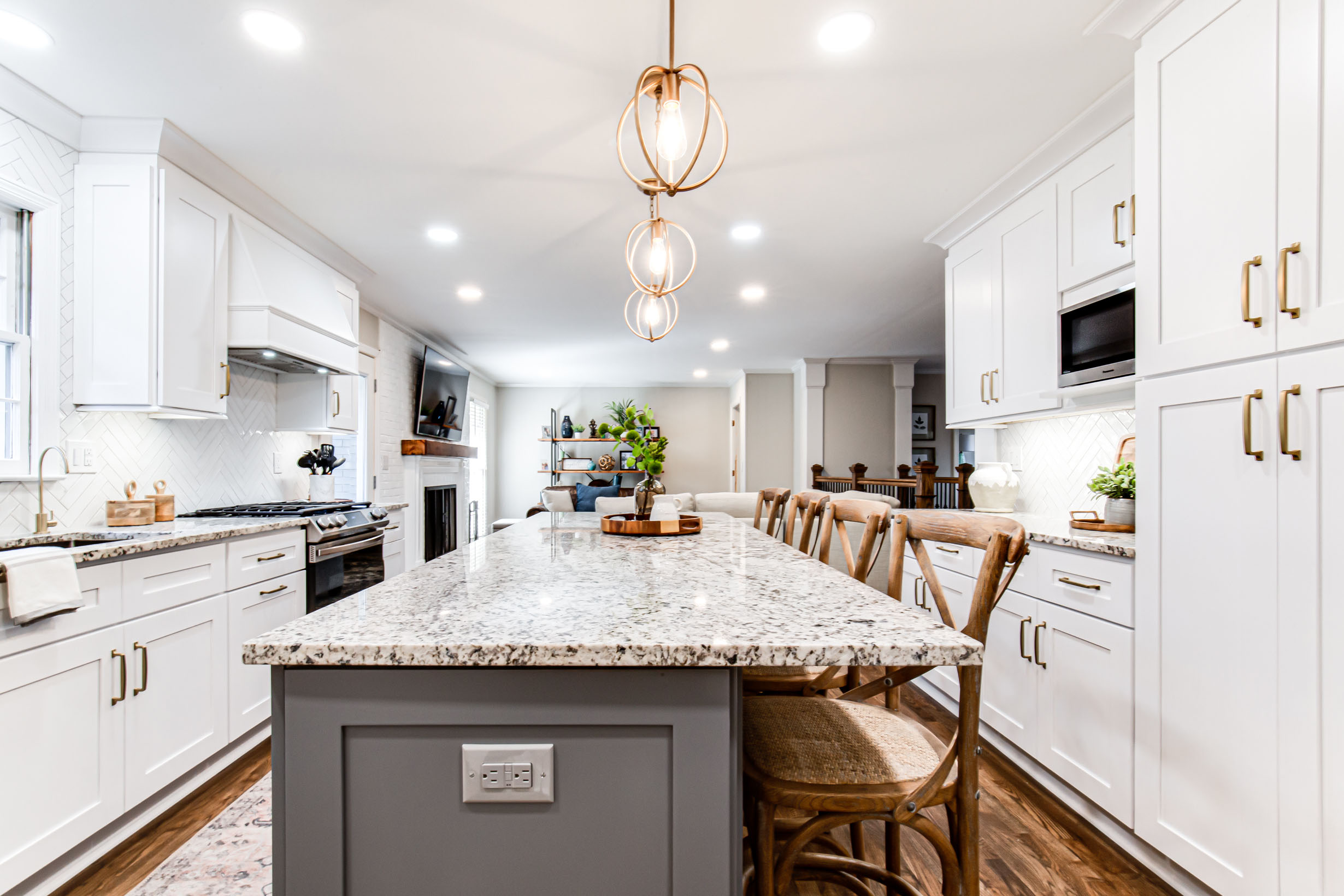
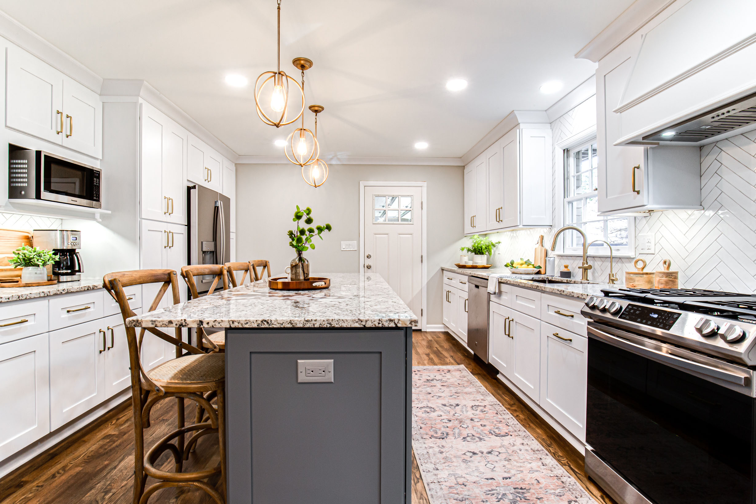
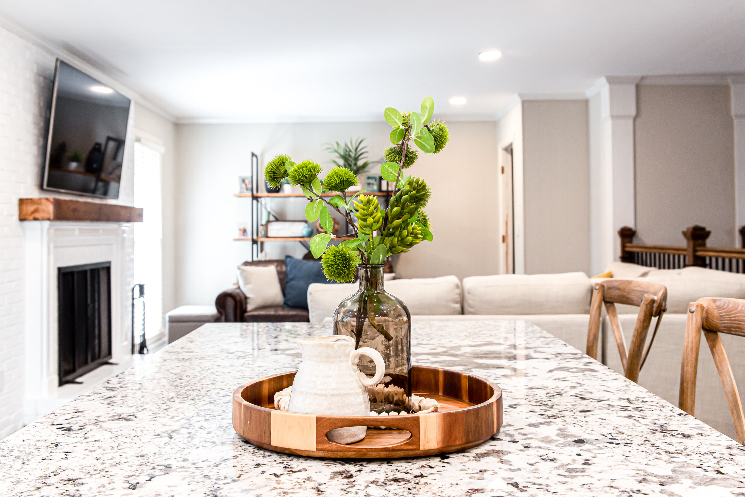
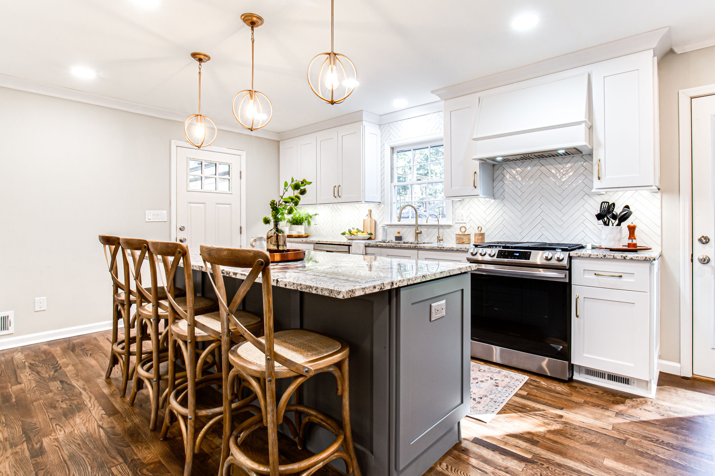
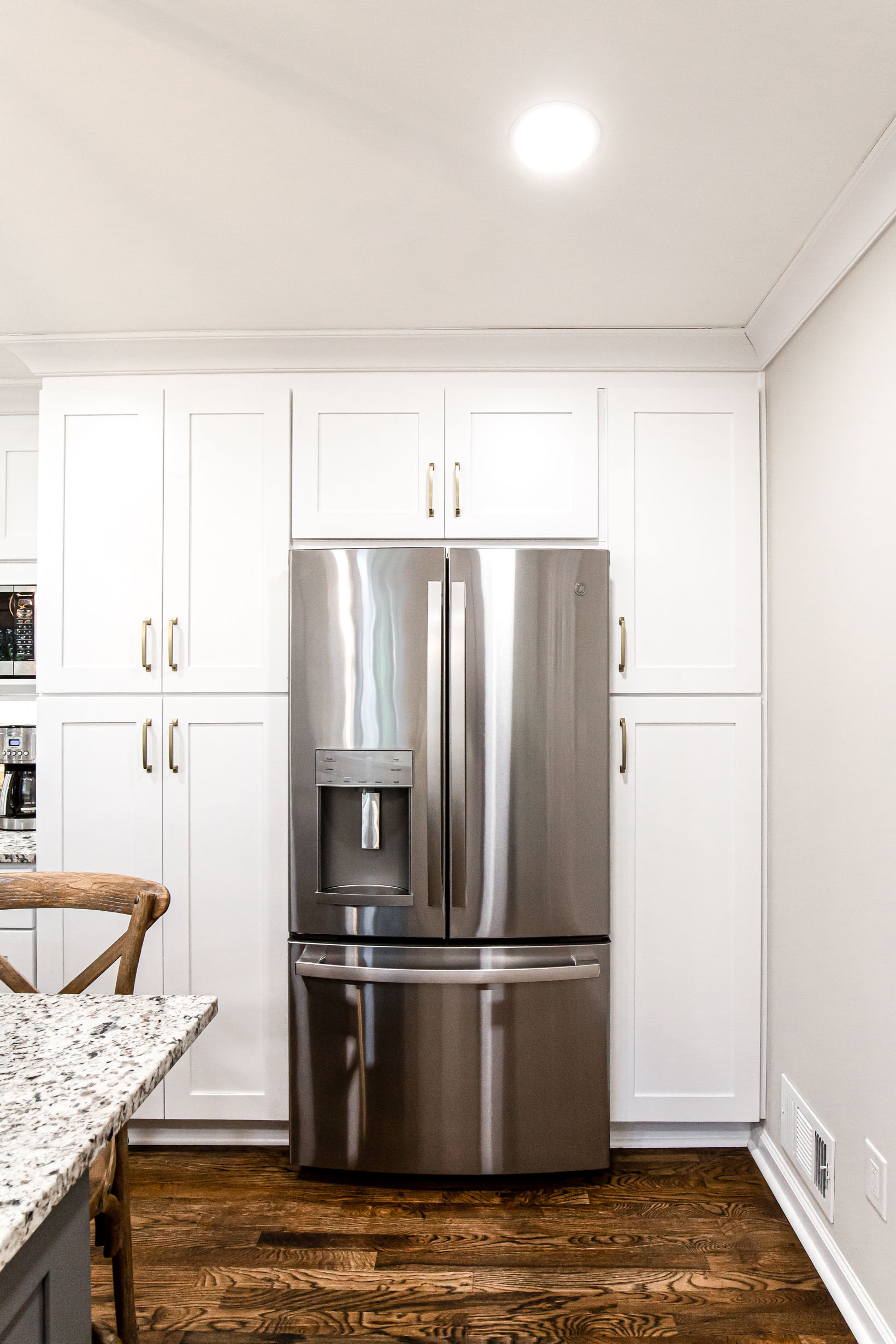
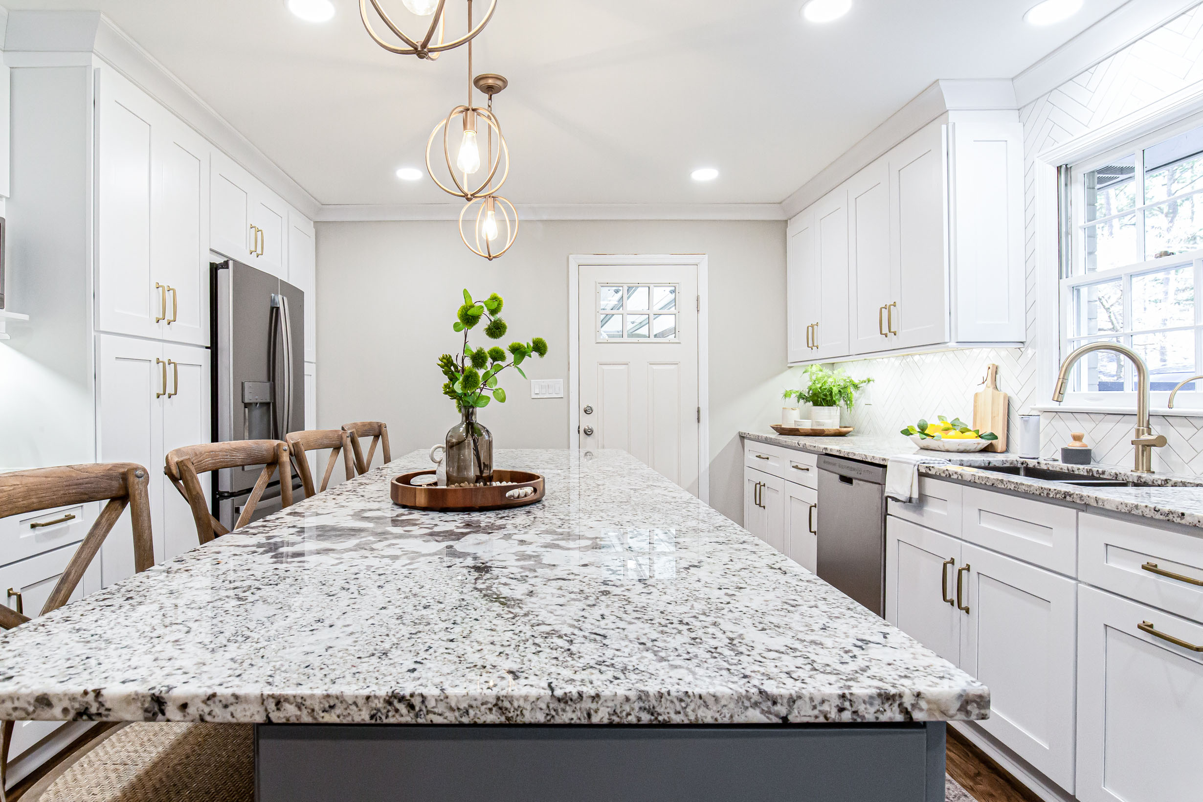
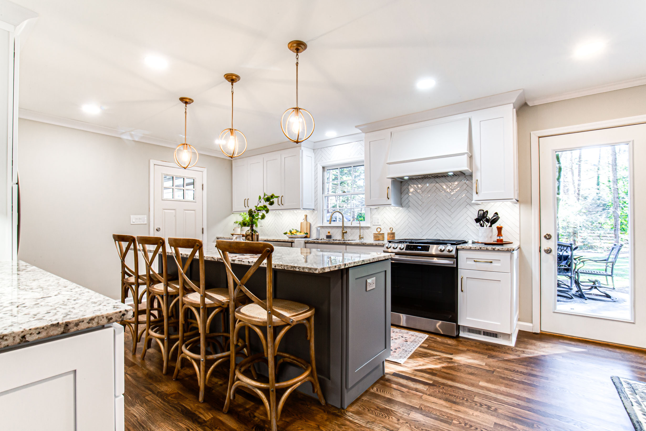
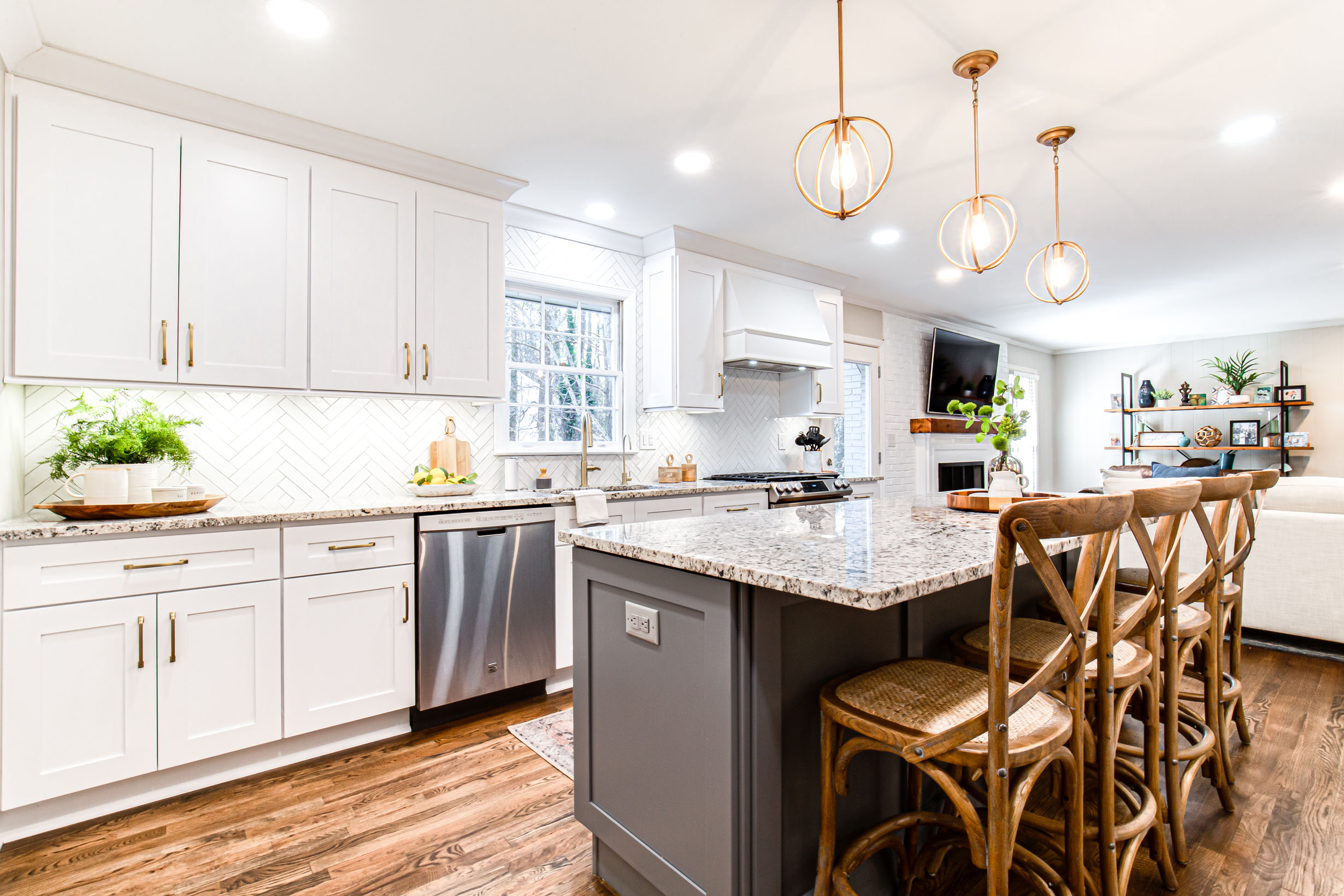
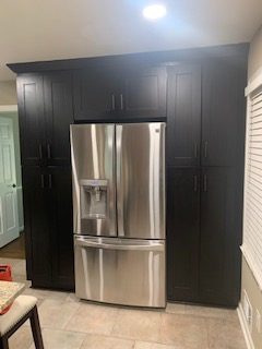
The design started by removing the wall to the living room and opening up the space. Since we lost that wall of cabinet storage we decided to relocate the door to the office to another wall so we has space for more cabinets.
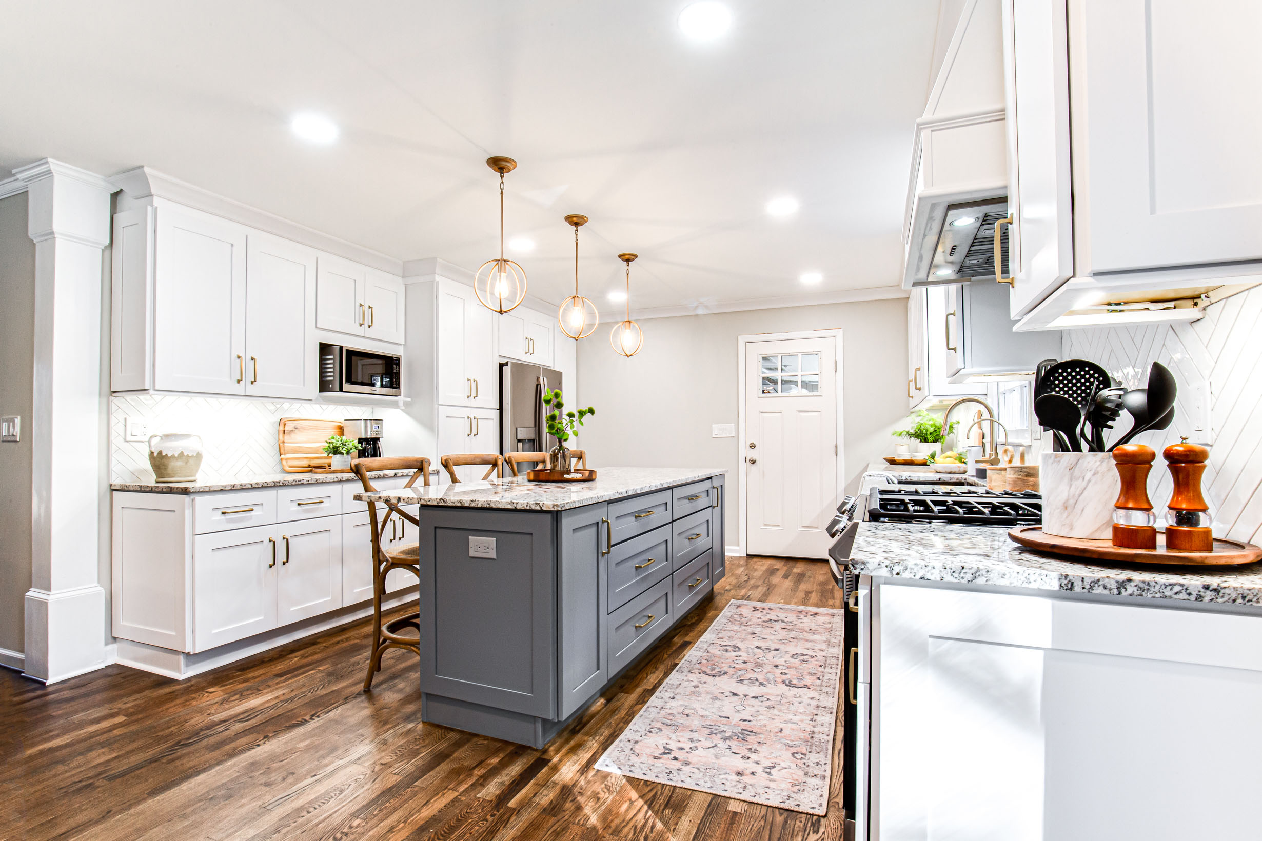
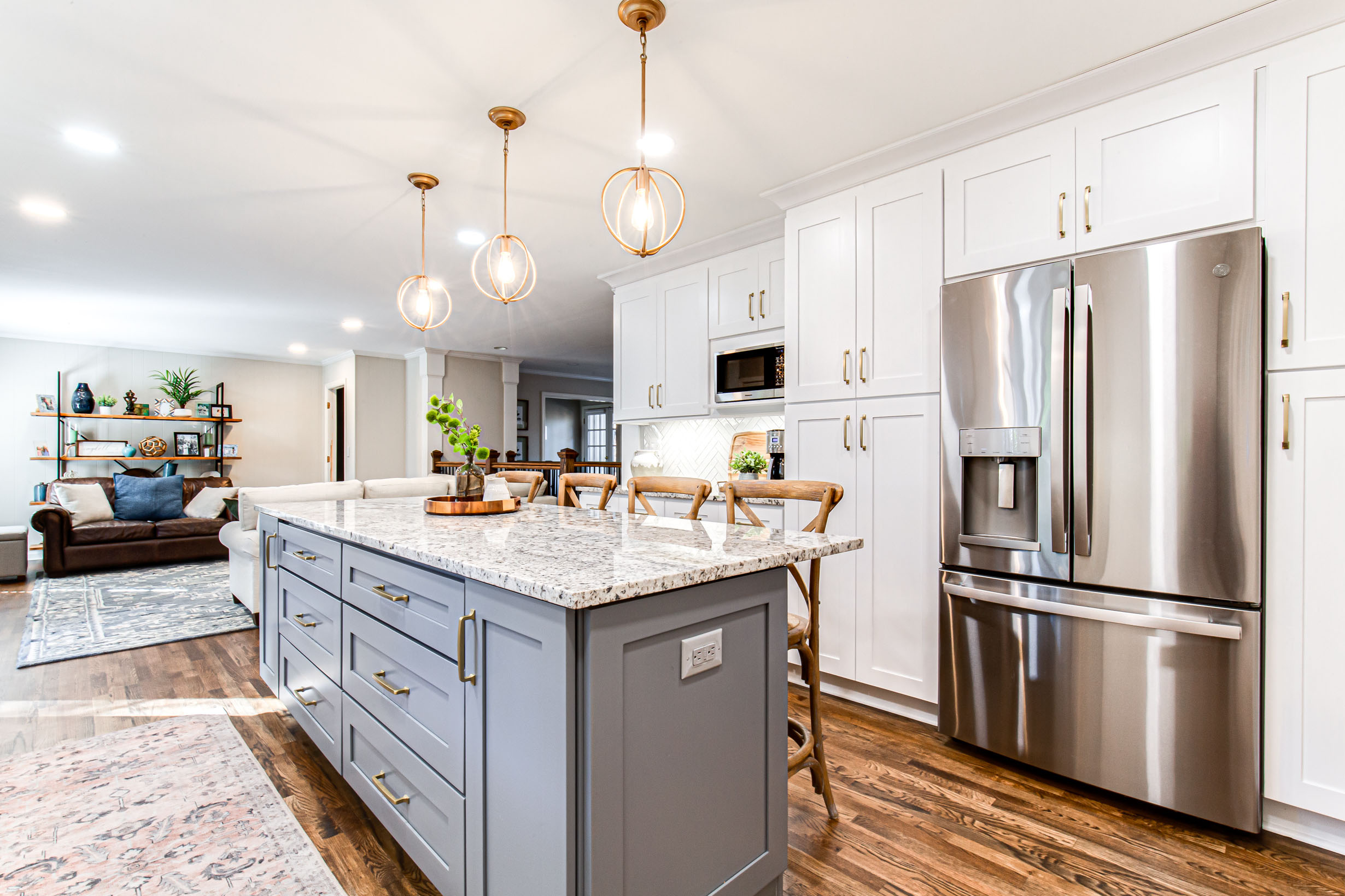
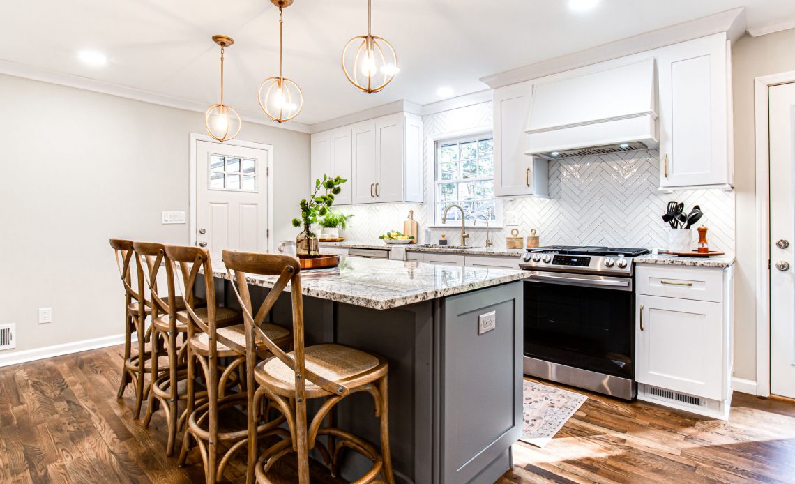
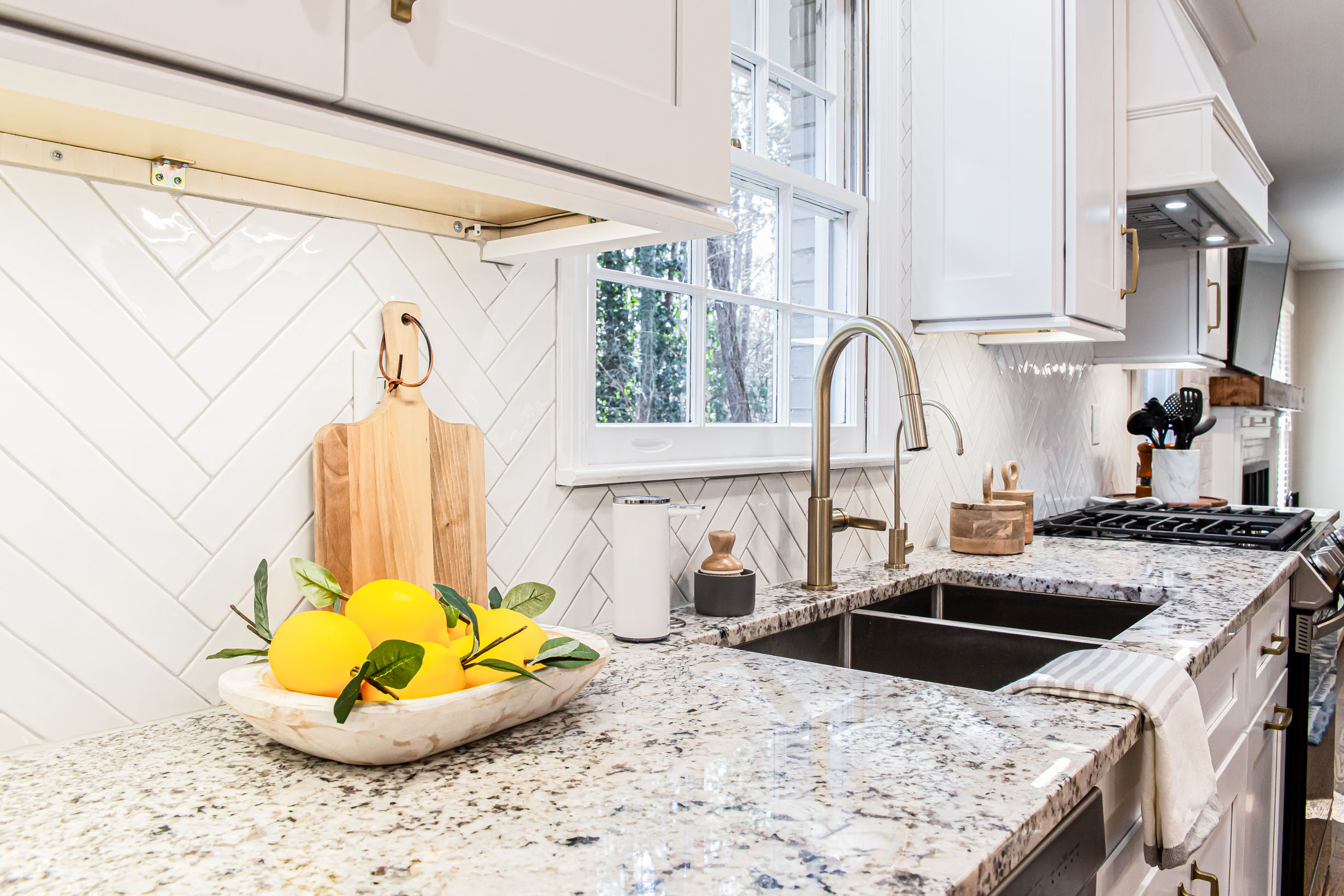
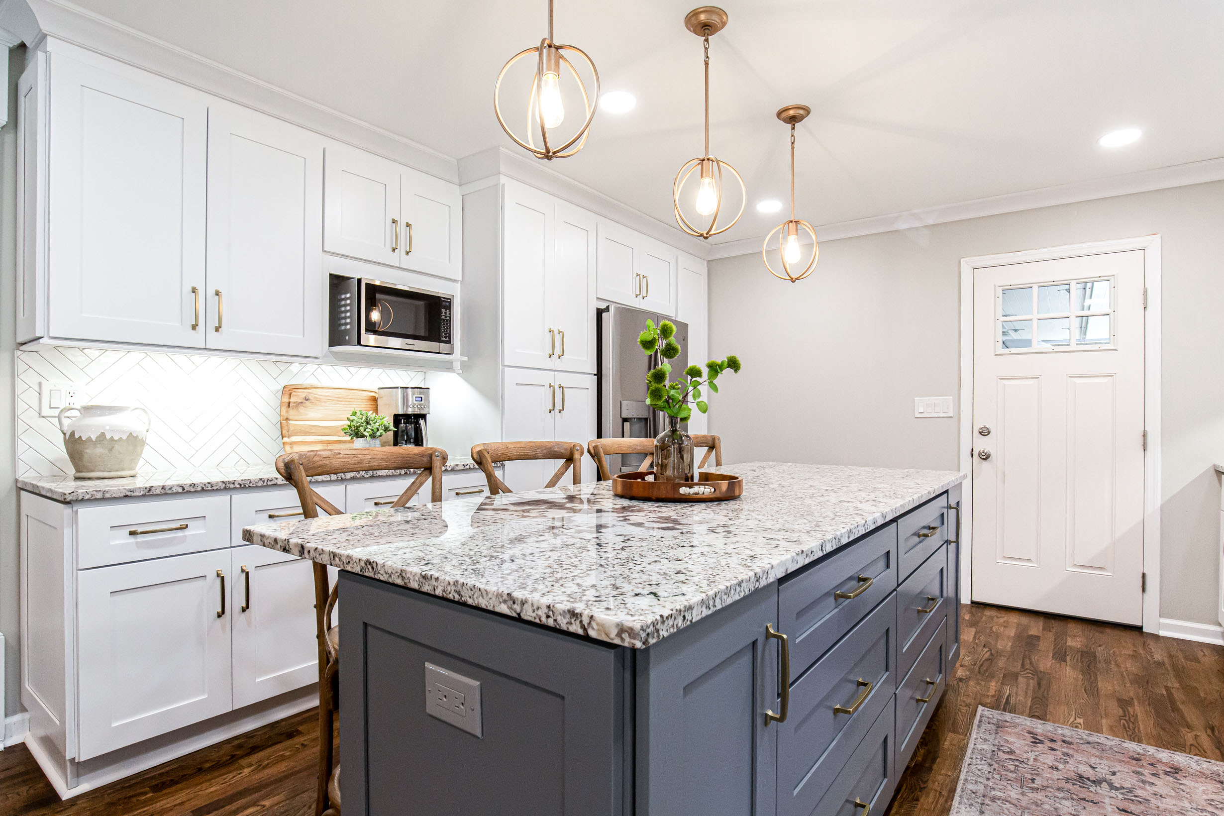
The soft white cabinets mixed with the gorgeous gray brought the light and warmth. The cabinet colors were the perfect starting point for the design aesthetic: classic and modern.
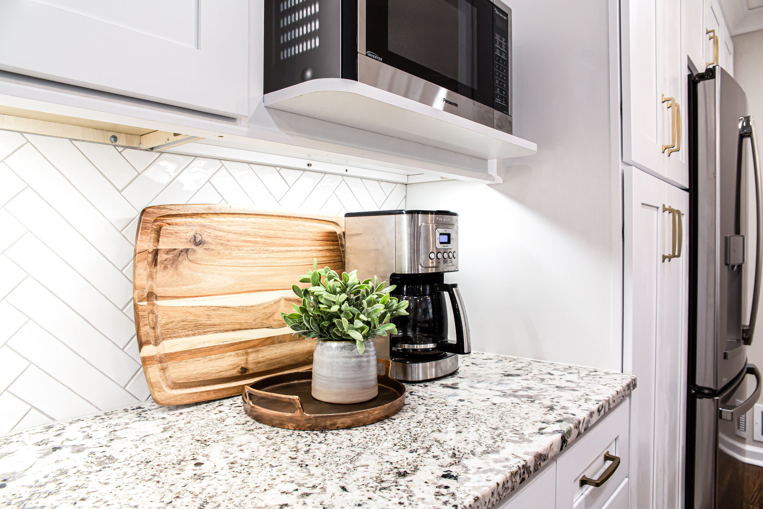
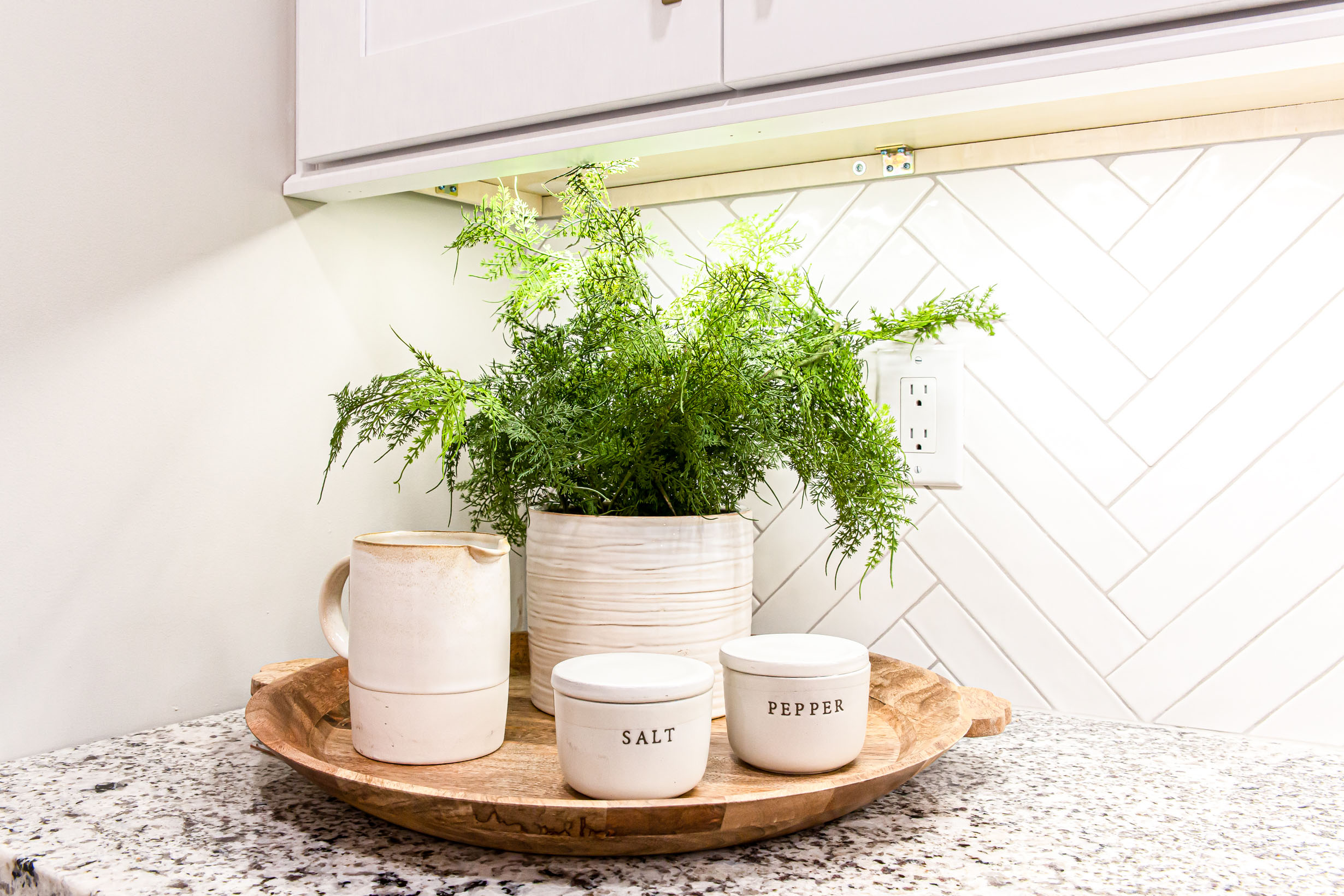
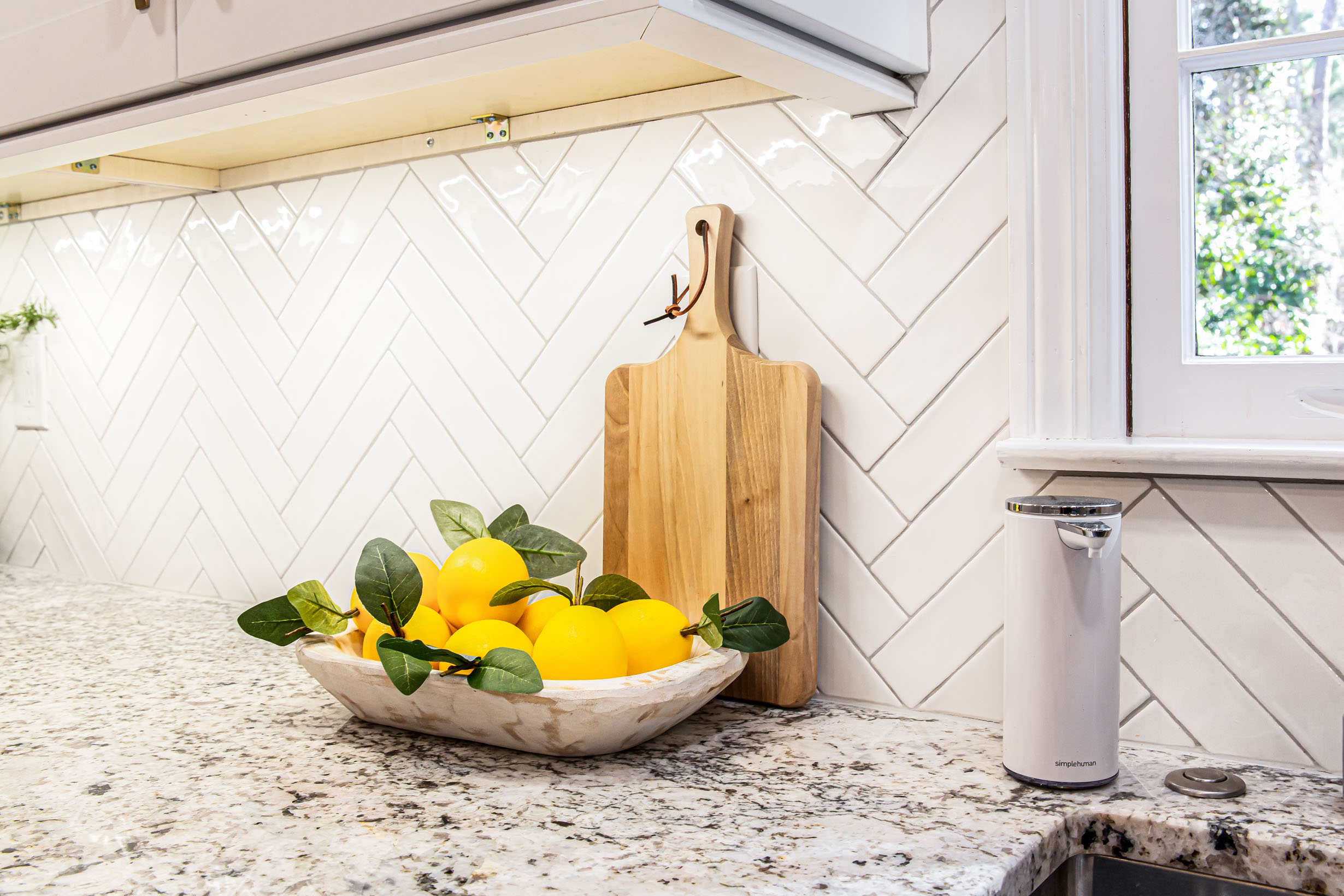
The white subway in the herringbone pattern was the perfect way to bridge the two design philosophies.”
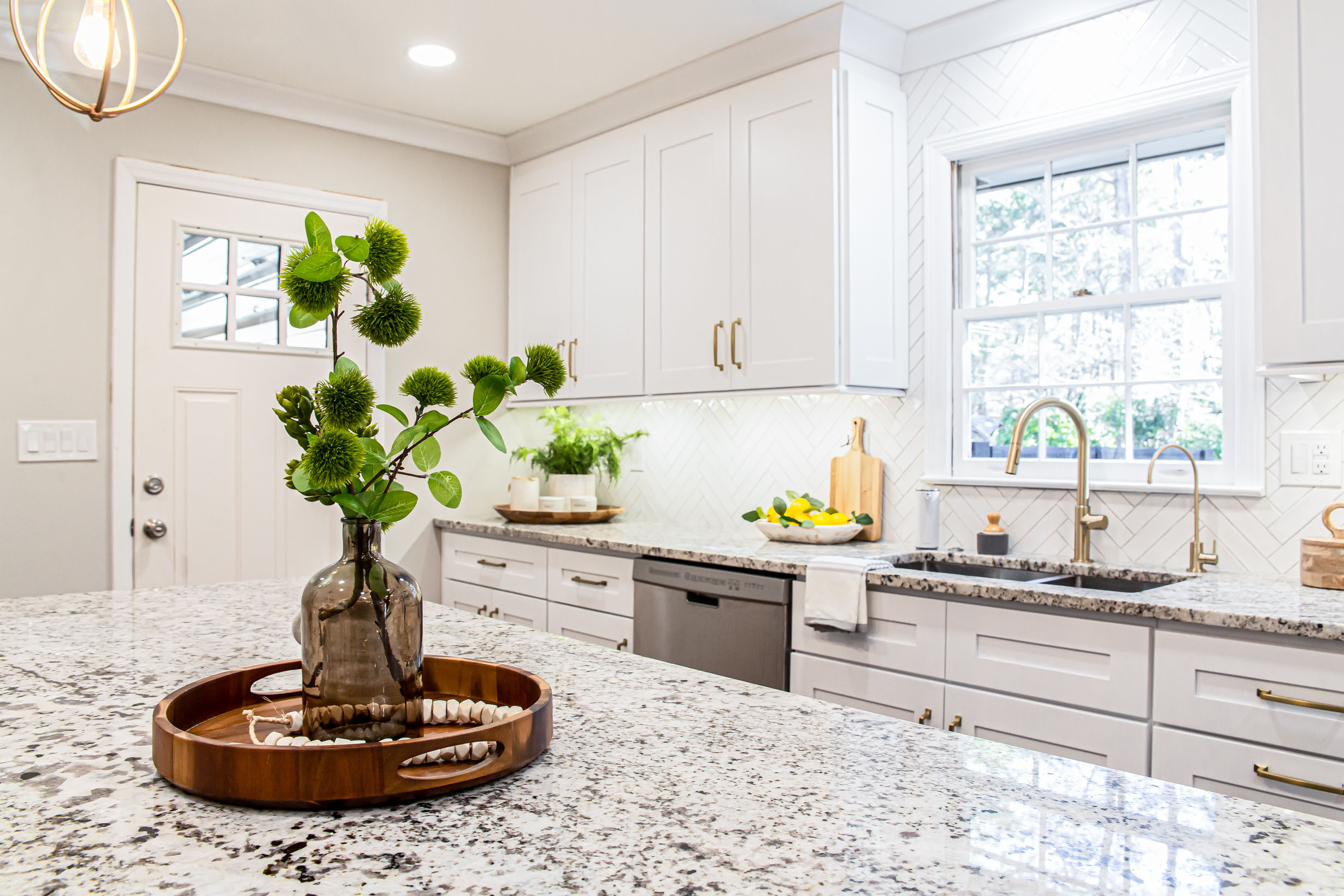
The classic subway was used but with a modern twist- elongated subway in a herringbone pattern. The traditional granite countertop pairs perfectly with the modern shaker door style.
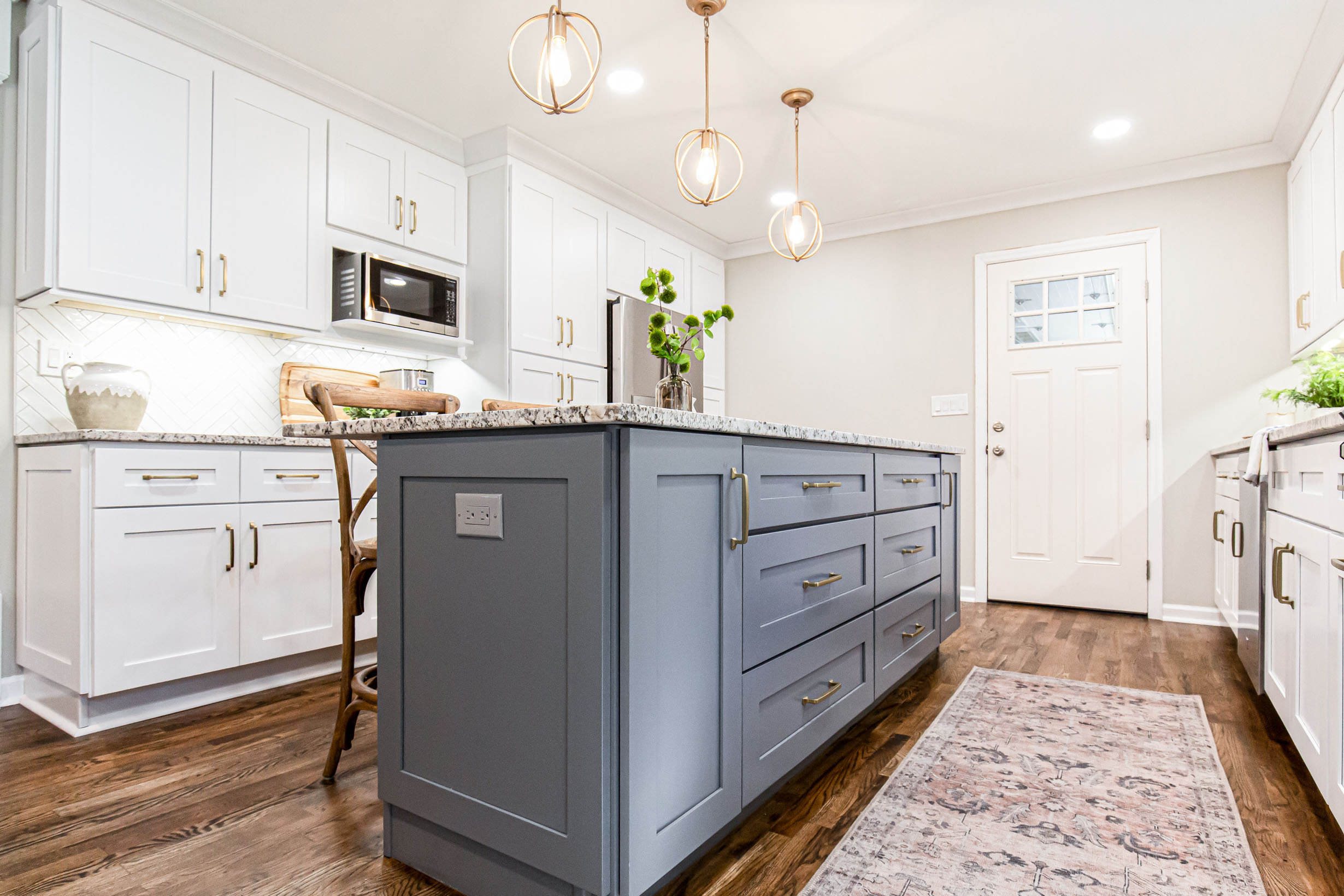
The client really wanted a large island with seating for when they enterain.
Scroll through and tell us your favorite part below


Here are the before’s:
Sources:
Range | Samsung
Hardware | Amerock
Pendants | Shades of Light
Barstools | Franklin X-Back
Backsplash | Soho Studios Boston
Grout Color: Mapei Warm Gray
Countertop | Pietra Bianca
Design & Staging by: Brittany Varela| Haggard Home Cabinetry & Design
Cabinets by: Haggard Home Cabinetry & Design
Photography by: JakSnap Photography